How to Reuse React Components Across Your Projects
Finally, you completed the task of creating a fantastic input field for the form in your app. You are happy with the outcome and continue to work on your assignments.
Next week, a team leader from another team asks you for help: "I need this done as soon as possible. Would you be able to lend a hand?" You happily accept.
As your organization strives for consistency, you're not surprised to find that he wants you to build a similar input component to the one you built a week ago.
You think to yourself, "I'll just copy and paste from my team's repo". It's not difficult to copy and paste, but what if we want to add more styles in the future? You'll have to change all instances of it. If there are only two components, that's fine, but what if there are hundreds? Think of all the buttons that people have created over and over again...
In this blog post, you will learn how to reuse every component that you have created using Bit. This is not a mistake. The components you create can easily be reused across all of your organization's apps. Ready. Set. Let's go!
You can watch me creating reusable React components here:
Setting up our Workspace
This guide assumes that you have a bit.cloud account and know how to open a remote scope.
We want that input component to be reusable, but we don't want to copy-paste it since it isn't scalable, so what should we do?
By using Bit, we can easily create reusable components. From versioning, building, testing, and even managing component dependencies, Bit takes care of everything for us.
Let's first make sure Bit is installed. Installing Bit is as simple as running a single command:
npx @teambit/bvm install
Now at the root of our project, we can initialize a Bit Workspace from a React template:
Pro tip: Hover over the commands and their flags throughout this tutorial for more information.
Navigate to the generated folder:
cd reusing-react-componentsWorkspaces serve as development and staging areas for components. We create new components, retrieve and modify existing ones, and combine them.
Workspace makes your development experience seamless as if it were a monolith, yet it remains distributed and highly scalable. Components are not stored in the Workspace. Regardless of whether they're stored on bit.cloud or on the local server, they can be imported into any Workspace.
Creating an independent component
Let's make our first Reusable React component!
Using the command above, a new component named ui/input will be created from the React template. By using the React template, we will create a new component, which will include a bit of boilerplate code, as well as the folder structure we need for new components.
Notice that a slash separates the name of the component.
The right part of the component name indicates its functionality(input).
The left part of the name is the namespace for the components(ui). Despite not being essential, the namespace is part of the components' name and helps us organize them into logical groups.
The component will be added to the .bitmap file:
"ui/input": {
  "scope": "",
  "version": "",
  "defaultScope": "nitsan770.reuse-components",
  "mainFile": "index.ts",
  "rootDir": "ui/input",
},In the .bitmap file, Bit stores information about which components are available in the Workspace. Manually editing this file is not recommended.
You can either copy the files from this folder into the generated folder(ui/input) or copy the snippets from this tutorial.
Here is the source code for the input implementation:
input.tsximport React from 'react';
import { Button } from '@nitsan770/reuse-components.ui.button';
import classNames from 'classnames';
import styles from './input.module.scss';
export type InputProps = {
buttonText: string;
} & React.InputHTMLAttributes<HTMLInputElement>;
export function Input({ buttonText, className, ...rest }: InputProps) {
return (
<div className={classNames(styles.inputContainer, className)}>
<input {...rest} className={styles.inputText}></input>
<Button className={styles.button} children={buttonText} />
</div>
);
}bit status is a very useful command that tells you what is the status of components preset in the Workspace.
Here's the output we get:
new components
(use "bit tag --all [version]" to lock a version with all your changes)

     > ui/input ...  issues found
       missing packages or links from node_modules to the source (run "bit install" to fix both issues. if it's an external package, make sure it's added as a package dependency):
          input.tsx -> @nitsan770/reuse-components.ui.button
input.tsx -> classnamesSince we have Button and classNames as dependencies, we'll have to install them in our Workspace:
In the generated folder, create a file called input.moudle.scss and insert this CSS:
.inputContainer {
  height: 56px;
  min-width: 320px;
  display: flex;
  flex-direction: column;
  justify-content: stretch;
  align-items: stretch;
  position: relative;
  .button {
    position: absolute;
    width: 103px;
    height: 40px;
    right: 8px;
    top: 8px;
    width: 30%;
  }
  .inputText {
    border: none;
    background-color: var(--bit-bg-dent, #f6f6f6) !important;
    color: var(--bit-text-color-heavy, #2b2b2b);
    height: 100%;
    width: 100%;
    border-radius: 8px;
    &.error {
      border: var(--bit-error-color, #e62e5c) 1px solid;
      background-color: var(--bit-error-color, #e62e5c);
    }
    &:focus,
    &:active,
    &:hover {
      border: var(--bit-accent-color, #6c5ce7) 1px solid;
    }
  }
}

.disabled {
  opacity: 0.5;
}Let's have a look at the lovely independent component in the Workspace UI:
The development server is up and running! However, we are unable to see anything 😔 . This is because we have not created any compositions for our newly created component.
Component compositions, documentation, and testing
Compositions allow components to be simulated in different variations. These can then be used for testing, visualization, and discoverability.
Let's create a composition for our component:
input.composition.tsximport React from 'react';
import { Input } from './Input';
export const BasicInput = () => <Input buttonText="Submit" />;Now we can see the component in the Workspace UI:
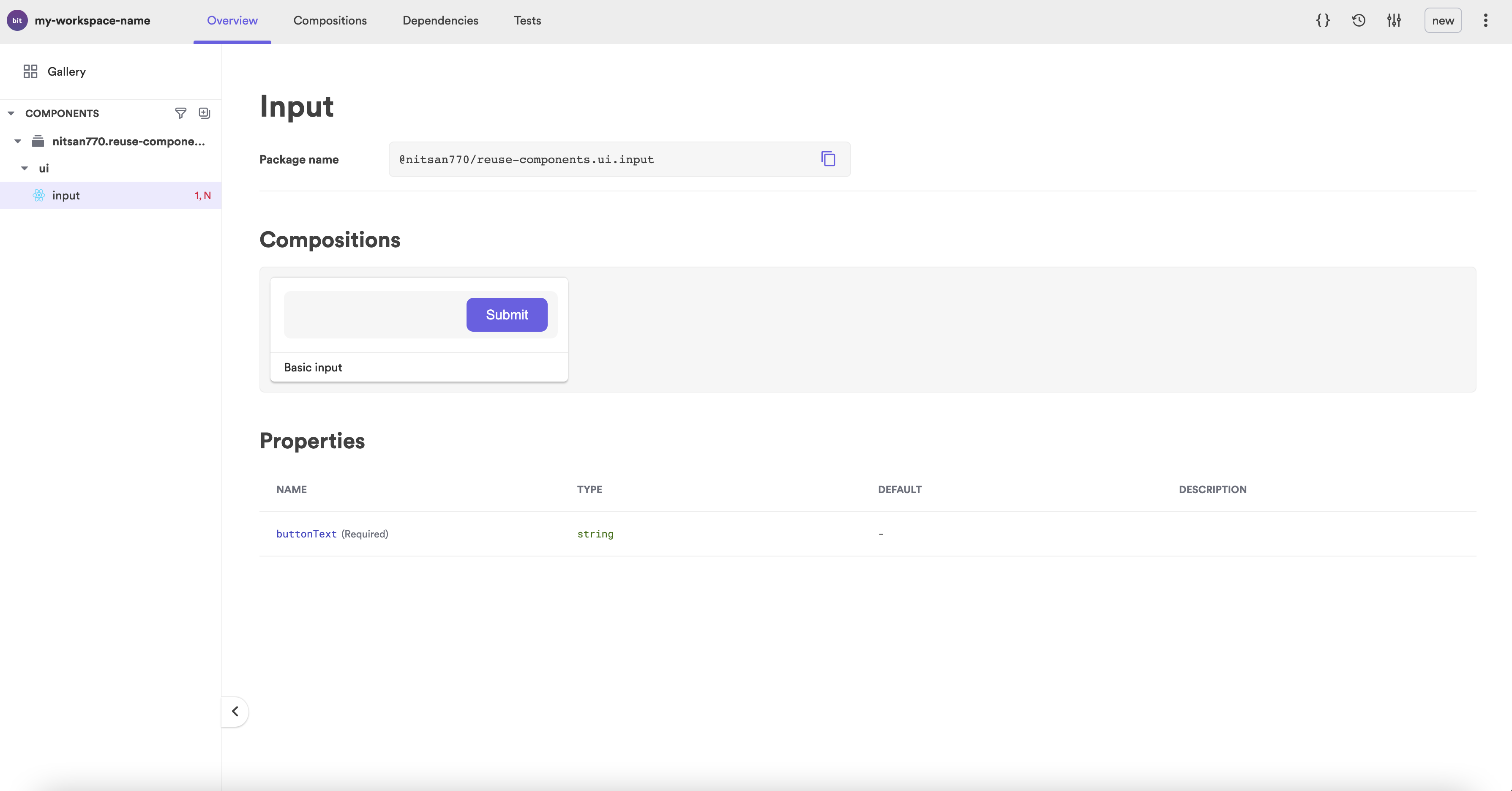
Yet it is difficult to understand how it works. Let's write some documentation.
Bit components' documentation is written in MDX. No more boring sentences; now you can embed anything you want to make your component more visually appealing.
input.docs.mdx---
description: An input element with a built-in button.
labels: ["input", "submit form"]
---
import { Input } from "./input";
### Modify the text on the button
'''js live
<Input buttonText="Go" />
'''It looks much better now, and consumers can try out the component before installing:
Last but not least, a good component is well-tested:
input.spec.tsximport React from 'react';
import { screen, render } from '@testing-library/react';
import { BasicInput } from './input.composition';
it('Renders the input', () => {
render(<BasicInput />);
const input = screen.getByRole('textbox');
expect(input).toBeInTheDocument();
});
it('Renders the button', () => {
render(<BasicInput />);
const button = screen.getByRole('button');
expect(button).toBeInTheDocument();
});
it('Renders the button text', () => {
render(<BasicInput />);
const button = screen.getByRole('button');
expect(button).toHaveTextContent('Submit');
});Let's run the tests:
All tests have passed. 🎉
PASS src/input/input.spec.tsx
  ✓ Renders the input (67 ms)
  ✓ Renders the button (19 ms)
  ✓ Renders the button text (12 ms)


Test Suites: 1 passed, 1 total
Tests: 3 passed, 3 total
Snapshots: 0 total
Time: 5.549 s
Ran all test suites.
test has been completed in 13.718 seconds.Publishing and versioning components
The last step is to tag the component with its (first) version.
When a component is tagged, it will also go through a build (and test) process in addition to locking the current state of the source files.
In this process, the component will be compiled to a distributable format and packed into a tar file.
Once the component has been tagged, it's time to publish it:
The component will be exported to your remote scope on bit.cloud.
Now that it has been published, we can use it in any React project.
Let's try it out!
Open a React project:
npx create-react-app another-projectYou can install the component using npm, yarn, or pnpm. Let's use pnpm:
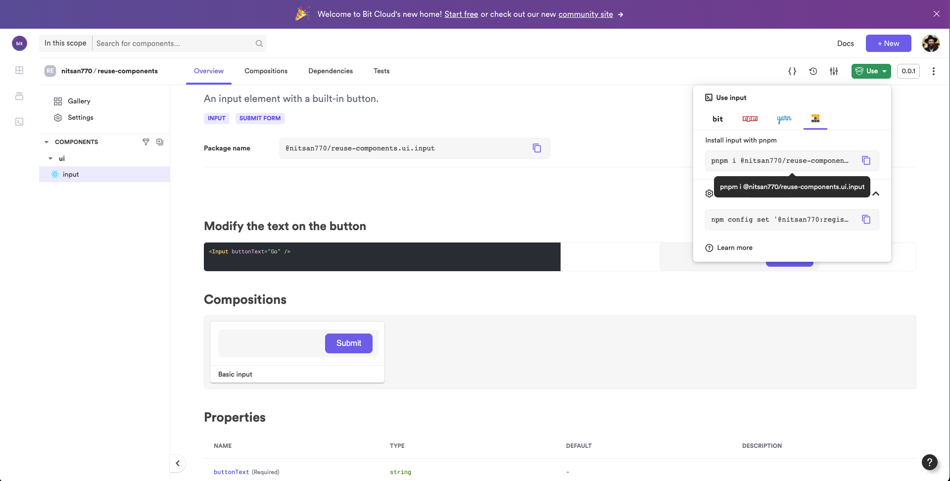
pnpm i @nitsan770/reuse-components.ui.input

## if you haven't yet, remember to add your bit.cloud account as a scoped registry:
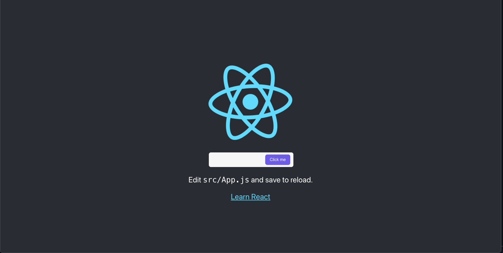
# npm config set '@[your-bit-cloud-user-name]:registry' https://node.bit.cloudWe can now use the component in the app.js file:
import logo from './logo.svg';
import { Input } from '@nitsan770/reuse-components.ui.input';
import './App.css';

function App() {
  return (
    <div className="App">
      <header className="App-header">
        <img src={logo} className="App-logo" alt="logo" />
        <Input buttonText="Submit" />
        <p>
          Edit <code>src/App.js</code> and save to reload.
        </p>
        <a
          className="App-link"
          href="https://reactjs.org"
          target="_blank"
          rel="noopener noreferrer"
        >
          Learn React
        </a>
      </header>
    </div>
  );
}

export default App;Let's run the dev server:
npm startIt's a perfect match!
Collaboration on components
Sometimes we need to change and fit a component in the context of a new project. Or, we would like to use our teammate’s component and fit it into our own project.
Bit makes this process very easy, as you can import (and even fork) components into any workspace, start working to edit and change them, and tag the new version.
Let's create another workspace to simulate collaboration:
cd a-new-workspaceNow let's retrieve the component from bit.cloud using the import command:
bit import lets us retrieve any component into our local workspace, edit it, and then tag and export it with a new version. It’s like having those superpowers you’ve always wanted like editing a node module’s dependencies. 🦸
Let's add a new prop to our Input component:
input.tsximport React from 'react';
import { Button } from '@nitsan770/reuse-components.ui.button';
import classNames from 'classnames';
import styles from './input.module.scss';
export type InputProps = {
buttonText: string;
disabled?: boolean;
} & React.InputHTMLAttributes<HTMLInputElement>;
export function Input({
buttonText,
disabled,
className,
...rest
}: InputProps) {
return (
<div className={classNames(styles.inputContainer, className)}>
<input {...rest} disabled={disabled} className={styles.inputText}></input>
<Button className={styles.button} children={buttonText} />
</div>
);
}It's time to tag it again. Naturally, you'll want to add new tests and compositions, but we won't do it here.
In order for everyone to benefit from this change, we must export it:
Once we are back in our original workspace, we can update by running...you guessed it - bit import!
cd reusing-react-componentsTo see the changes in the source files, we will also need to checkout the latest version:
Now we're in sync with each other's updates :D
Be sure to update the React project where our input component is installed. Bit publishes a new package every time we tag a component, so we can run the following command to update it:
cd another-project
pnpm update @nitsan770/reuse-components.ui.inputWe now have our updated button in the React project :)
Summary
Our objective in this guide was to learn how to create reusable components using Bit.
We explored the process of creating a component from scratch and learned about all the parts (files) that make up a complete component.
We also saw how to install the component in any React project.
Last but not least, we learned how to collaborate on a component, get updates and stay in sync with each other.
This tutorial was hopefully enjoyable for you. I am sure that there is more that can be learned.
Please read our documentation if you want to learn more.
If you have any questions, please ask them in our slack channel.
Best of luck!